Written by Ray Masaki
My article on creating a brand name went pretty well, so I wanted to follow it up with a little bit about logo design. So I realize how huge a topic branding and logo design is, so believe me, I am by no means saying that I am any kind of master of logo design. The purpose of this article is just to provide a little bit of insight for brands with amateur designers like you and me. There is a whole science behind professional brand/logo design that you would probably take a college course for if you really wanted to get into it.
1. Research and Brainstorming
So the first and most important step of coming up with the perfect logo is research and brainstorming. There is no way in hell that you can come up with the perfect logo on the spot, and there’s absolutely no way you can come up with your logo without first thinking of a concept. In a way, coming up with your logo is just like coming up with your brand name, you have to really look at it through your audiences eyes, and try to understand what they perceive from looking at your brand.
With logo design, the golden rule is to pretty much keep it simple but appealing, less is usually more. Think of the best and most recognizable logos in the world. Brands that come to mind for me are: Fedex, Nike, and Apple. These logos sparingly use any design elements, but are instantly recognizable and convey the tone of their company.
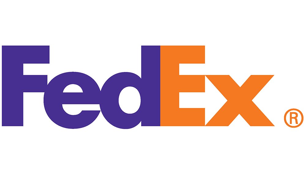
Fedex: One of the most ingenious logos in my opinion. The font (futura bold, I believe) is very legible, and if you look between the ‘e’ and the ‘x’, you can see the arrow, which suggests that Fedex will definitely get your packages sent on time with ease.
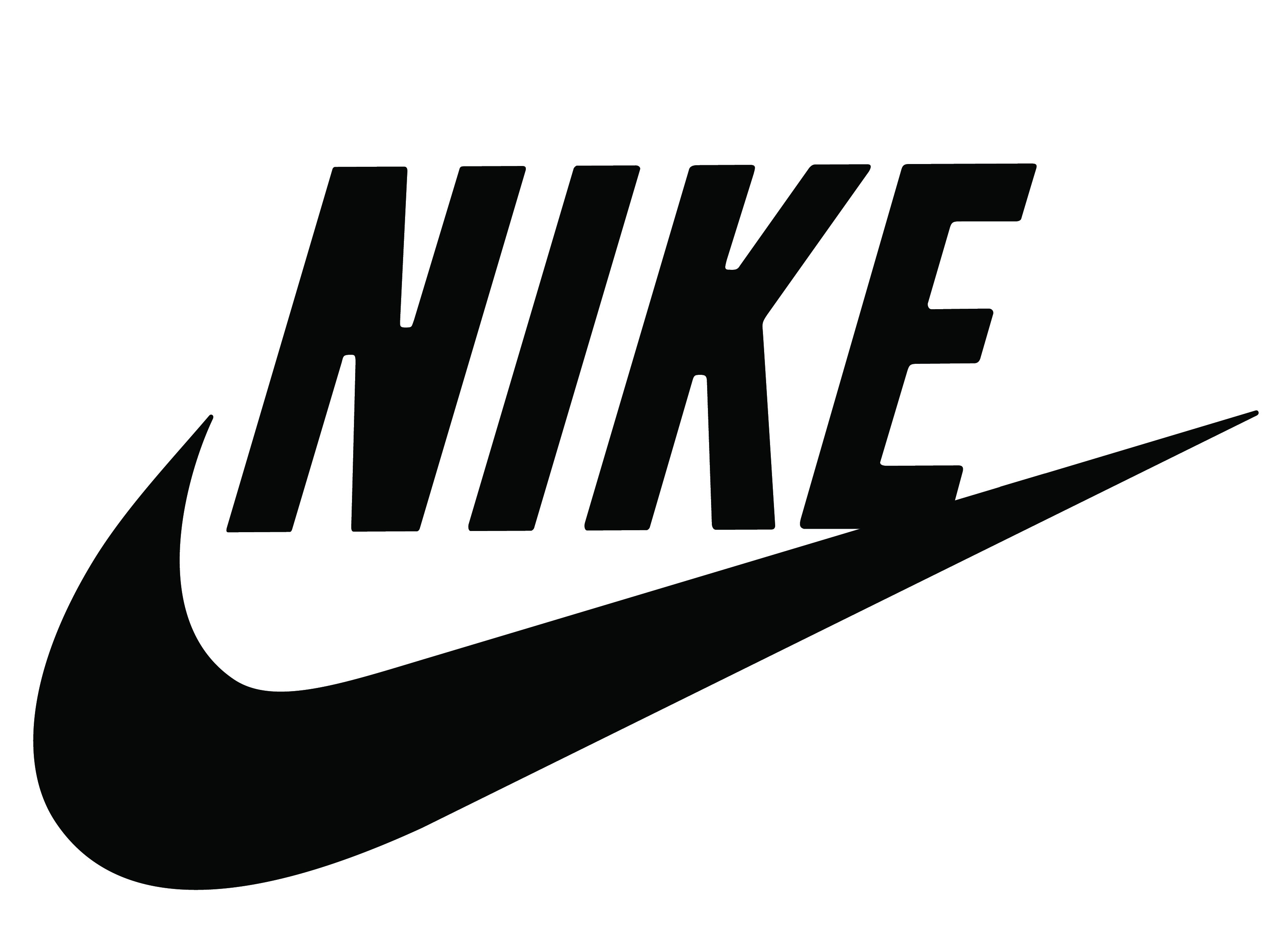
Nike: The Nike symbol is also very recognizable. There is a sense of agility that matches the tone of this sports equipment brand. Simple and perfect!
Apple: Apple is known for its clean aesthetics and the apple logo perfectly matches these aesthetics. It’s very simple and clean, and cannot be mistaken for another brand.
![]()
With my Mouthcan logo, I originally had a complex halftone in the mouth. I later realized that it was too complicated, and made the logo look distracting. Less is more, so taking the halftone off was actually beneficial.
So now, as a clothing brand owner, what is the message behind your brand? Is it aggressive? Is it sporty? Is it fun and bubbly? Whatever the theme of your brand is, the logo has to match the aesthetics.
2. Conceptualize
Now you have to make a few design choices. Do you want a graphic logo? Do you want a font that utilizes a unique or custom typography? Do you want to do a combination of both? So now it’s the hard (or maybe fun) part. Sketch out everything that comes to mind. SKETCH!
When I was first thinking of my logo for Lowdtown, I wanted to use custom typography.
So I sketched out some handwritten logos, however, the look wasn’t really what I wanted in a logo. Though it was nice, it didn’t really have the “bold” feel that I wanted.
So next, I played around with custom typography that was a little bit more fun and exciting. I played around with the idea of replacing the “O” in LOWDTOWN, with a mouth. Since “lowd” is a play on words with “loud”, I wanted to graphically making something that said loud. So I tried to make it into a mouth, but that too looked awkward and didn’t fit.
Next I tried replacing the O’s with a character. I wanted a way to make one character out of both O’s. I finally started getting the feel that I was looking for. I gave a boxier look to the typography, and gave slab-serifs to the type. In my second attempt of playing with this idea, I made the bottom O, just a big mouth. Then it struck me; the O resembled my Mouthcan character. So it seemed perfect to make Mouthcan into the O.
I ultimately ended up having two logos. I have my typographical logo and my branding logo. This adds a little versatility, and my thoughts were that once people recognize my Mouthcan logo as “Lowdtown Friends & Freaks”, I could get rid of the typography.
3. Computerize
So I don’t want to really get into the nitty gritty technical part of designing the logo, but I really recommend using Adobe Illustrator. That way, you can resize your logo to any size without worry about anything. If you have a graphical logo that you sketched and want to trace, use the pen tool instead of the custom brush tool or anything else like that. You’ll get the sharpest lines and corners, and that’s very important for a logo, unless you’re going for a sloppy or messy look. Also be as precise as possible, if you’re making a straight line make sure it’s straight. Little flaws like that will come back to bite you in the ass.
Here’s another very important step. You have to really consider the application of your logo. Most likely your logo will be for web-based applications and also for print. So here’s what you have to do:
- Make your logo really big, and take a look at it. Think about what your logo would look like if you put it on a poster. Would you see all the messy details? If you do, maybe you need to make it cleaner or simpler.
- Do the opposite now. Make your logo really small. Can you still tell what’s going on? If you have typography is it still legible?
- If your logo has more than one color, try making it black and white. Imagine printing your logo and you only have black and white. Does it still look good?
If you’ve tried these, and observed them in both web and print and it still looked good, go on to the next step.
4. Reflection
Once you think you have the look of your logo down, don’t be afraid to ask for opinions, unless it’s like top secret or something, by which case you’re probably a professional so you shouldn’t even be reading this. This is a very crucial step because you want to know if your font is legible if it’s typographical, or if people can tell what your logo is if it’s graphical (think Apple, easily identifiable as the fruit).
For Lowdtown, I put up a post on a forum asking what people thought about my logo. At that point, my logo was in a square format with color rather than horizontal and black/white, and thanks to the Emptees community, I realized that the logo was much more legible when it was horizontal and in black. I gave the Emptees community a bunch of possible colorways and logo ideas that I had in mind. Then I let them choose which one was their favorite, this way they can tell you what looks good rather than making them figure out what would look good.
Finally, give yourself a critical look at your logo. Does your logo reflect your brand? For Lowdtown Friends & Freaks, I wanted to be recognized as a bold streetwear brand, so I didn’t want to be viewed as cute or grungy. I feel that Mouthcan got the job done, because it is neither too cute nor too aggressive in my opinion. However, one thing I was afraid of was that Mouthcan could be associated with the fratboy, beer-drinking culture.
However, I think I managed to avoid that by making the mouth of the can very graphical rather than silly looking (no offense to you fratboys). But just keep in mind that some people may look at your logo differently from what you think it may be perceived as.
So that’s about it. I hope this gave you some inspiration to make a kickass logo! Keep in mind, this is not the only way to make logos. A lot of the greatest logos are great because they break a lot of rules. If you want to check out some really amazing logos for inspiration go to logopond.com. Good luck guys, keep your minds open!
Need an E-Commerce Website?
 Shopify is perfect for beginners and experts. You don't need to have any technical or design experience to easily create a beautiful online store with your branding. Choose from tons of well designed e-commerce templates that look great on desktops, phones, and tablets. Easily customize, create pages, add products, and you're pretty much ready to accept payments. Plans come with a free no risk 30 day trial period.
Check out our in depth review of Shopify here and see why Shopify is our number 1 recommended shop for clothing companies.
Shopify is perfect for beginners and experts. You don't need to have any technical or design experience to easily create a beautiful online store with your branding. Choose from tons of well designed e-commerce templates that look great on desktops, phones, and tablets. Easily customize, create pages, add products, and you're pretty much ready to accept payments. Plans come with a free no risk 30 day trial period.
Check out our in depth review of Shopify here and see why Shopify is our number 1 recommended shop for clothing companies.