This article was written by Sol Amstutz
Utilizing halftones is a pretty quick and easy step to create the illusion that you are using more colors in your design than you actually are. Subsequently, this will help cut down printing costs for your client which will make them happy.
The important thing about halftones is to know how and when to use them as a neat little trick.
This will be just a basic, quick step-by-step on creating a halftone fairly easily.
To start off, you want to make a new document in PS that is EXACTLY the same size as the document you are working in. Now, there are a few ways that you can use this process to place halftones depending on what you need, but I’ll get into that later.
First, in you new document create a shape or selection that fits the area you want your halftone in. For this example I just made a quick shape.
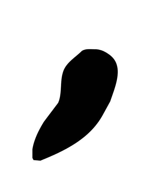
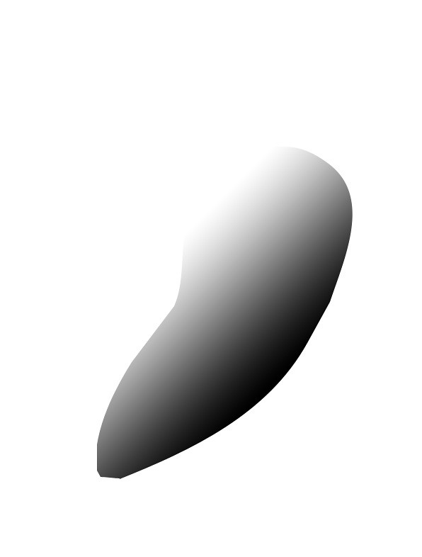
You can’t halftone straight black, so it needs to be a shade of gray. For this example I’ll throw a black to white gradient on my shape.
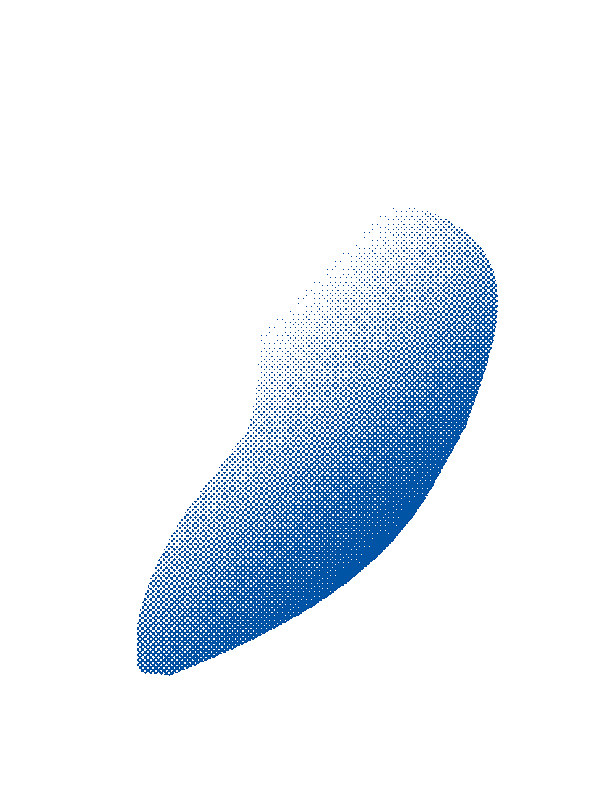
The next step is to set your document to “Bitmap” mode (you’ll have to convert to Grayscale if you haven’t already). To this, simply go to Image>Mode>Bitmap…
Once you’ve converted to Bitmap, a dialogue box with ask you to flatten layers. Go ahead and click ok. The next box will have how you want to set up your bitmap document.
-Set output to 300 pixels/inch
-Use the Halftone Screen method
Once you’ve done this, the “Halftone Screen” dialogue box will appear. There are various settings you can mess around with, and I’m by no means an expert at these, but I generally keep the Frequency between 20-45 and the Angle at 45. For this example, I set the Frequency to 25. Click ok.

Your halftone should come out looking something like this. Again, you can mess around with the frequency to get larger/smaller dots in your halftone. But you’re not done yet.
Convert your document back to grayscale and unlock the background layer. Then go to Select>Color Range and select white. Put the slider all the way up to 200 and click okay. Now you’re going to want to hit delete to get rid of the background.
And viola! Now all you have to do is drag your halftoned shape back into your original document and use a color overlay to get it to be whatever color you like.
Now as I said before, there are a lot of ways to use halftones for different effects. Below is an example of a t-shirt illustration I did for The Word Alive.
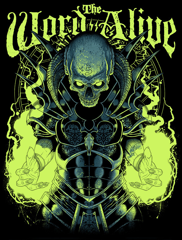
At first glance, there appears to be no halftones in the design. However, if you’ll notice the hands on each side appear to be slightly a lighter shade of gray than everything else.

If we zoom in closely, we can see that I achieved a “fading” effect on the hands since they are covered by this mystical light (oOoOoOo I know). I did this by simply selecting the green layer, cutting that section of the hands out, halftoning them, and putting them back in the original design.
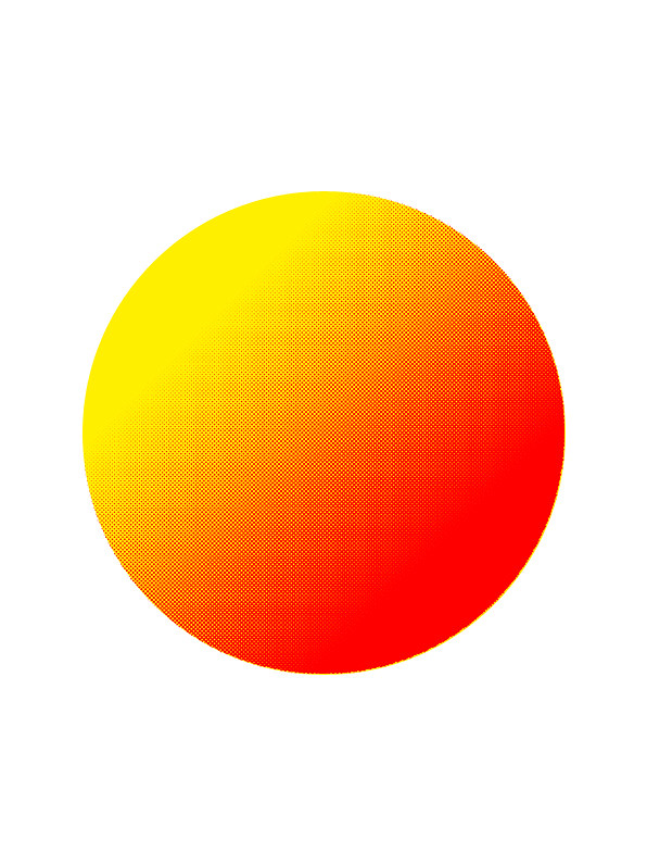
Another way you can use halftones is to achieve the look of a gradient in your design. Below I used the same process explained above and simply placed the halftoned shape on top of a solid color.
So there you have it! It takes some tedious processing sometimes, but halftones are a pretty simply way to make your design look sharp and cut down on color use.
Hope you’ve enjoyed this tutorial, and go halftone your hearts out!
Need an E-Commerce Website?
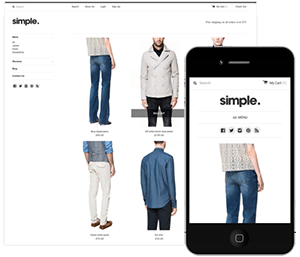 Shopify is perfect for beginners and experts. You don't need to have any technical or design experience to easily create a beautiful online store with your branding. Choose from tons of well designed e-commerce templates that look great on desktops, phones, and tablets. Easily customize, create pages, add products, and you're pretty much ready to accept payments. Plans come with a free no risk 30 day trial period.
Check out our in depth review of Shopify here and see why Shopify is our number 1 recommended shop for clothing companies.
Shopify is perfect for beginners and experts. You don't need to have any technical or design experience to easily create a beautiful online store with your branding. Choose from tons of well designed e-commerce templates that look great on desktops, phones, and tablets. Easily customize, create pages, add products, and you're pretty much ready to accept payments. Plans come with a free no risk 30 day trial period.
Check out our in depth review of Shopify here and see why Shopify is our number 1 recommended shop for clothing companies.