As mentioned in Part One, discharge inks are designed to work properly with cotton fibers and will give the best and brightest results onto 100% cotton shirts. 50/50, 65/35, CVC and Tri-blends can often have discharge inks printed onto them, but the results can vary drastically and it is best to understand the results or to speak with someone at your shop who will be able to best prepare you for how it may print. Images of each point I touch on will be shown.
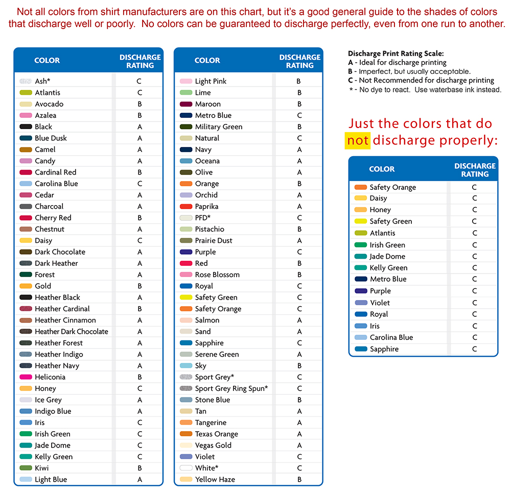
Certain color shirts are discharge’s enemy, such as a royal blue tee. A list of colors provided by Gildan grades how some colors discharge. This color chart applies to most other brands in a similar success ratio. Gildan’s chart is shown below and although they offer a ton of colors other companies do not, the tones crossover. So, a saturated blue or traffic light green color on other brands may have similar results.
Even when printing something as simple as white ink onto a 100% cotton kelly green American apparel tee, the ink may not end up bright white, but could have a slight greenish tone to the white. It does not look bad and can be used intentionally to create a certain look, but it is good to know what results can occur. Printing with discharge inks requires some flexibility and a concern for the success of the final printed product, as opposed to a tight restriction of a specific pantone color. Often with multi color discharge prints, dialing in the tonal balance and proper contrast between colors should outweigh the need for specific color accuracy.
 Why does this happen and why do I need to be flexible? Mixing and creating discharge inks is a chemical process and the colors can shift from what the original looked like. When mixing plasti-charge inks (50% clear plasti-charge/ 50% of a specific plastisol ink) you are thinning out the amount of pigment and the color may lighten a bit. Once the ink has been printed, it removes the dye on the shirt and re-dyes natural cotton that has its own tone that varies slightly among brands, but falls into the light tan category. This mixing of the fibers and ink varies the color a bit too. How much variation? Well, it can range from a single pantone color, maybe a cool grey 8 looking a bit more like cool grey 7, to slightly larger shifts. This chemical reaction that affects the end result is why some flexibility is needed. If you really need a specific pantone because your company uses it on everything, discharge may not be the way to go. This by no means implies that you cannot do multi-color discharge prints. You can and to great success! Check out the George & Dragon example from Acme Prints, which will also illustrate a 100% cotton print vs. a 50/50 of the same exact print.
Because the chemicals in discharge inks are designed to work with 100% cotton, printing onto a poly cotton blend will give much more subdued colors. The example shown of George & Dragon is the same exact print, same colors, printed one after the other. On the 100% cotton tee, the colors are bright and vibrant. On the 50/50 cotton/polyester blend, you can easily see how much darker the colors all are. The reason this happens is because the discharge ink is only re-dying the cotton portions of the garment, in this case, 50% of it. So, logically, the color will not be as bright. If a subtle print is what you are looking for, you can print onto a poly cotton blend. Again, flexibility is key in this situation. A white discharge print onto a 50/50 or 65/35 black tee will leave something that looks pretty dull and greyish, which may be exactly what you are trying to achieve as well. This would be a scenario where you can use the chemical reaction in your favor to get a look unattainable with standard inks, but it is always best to know what your end product may look like when doing this kind of print.
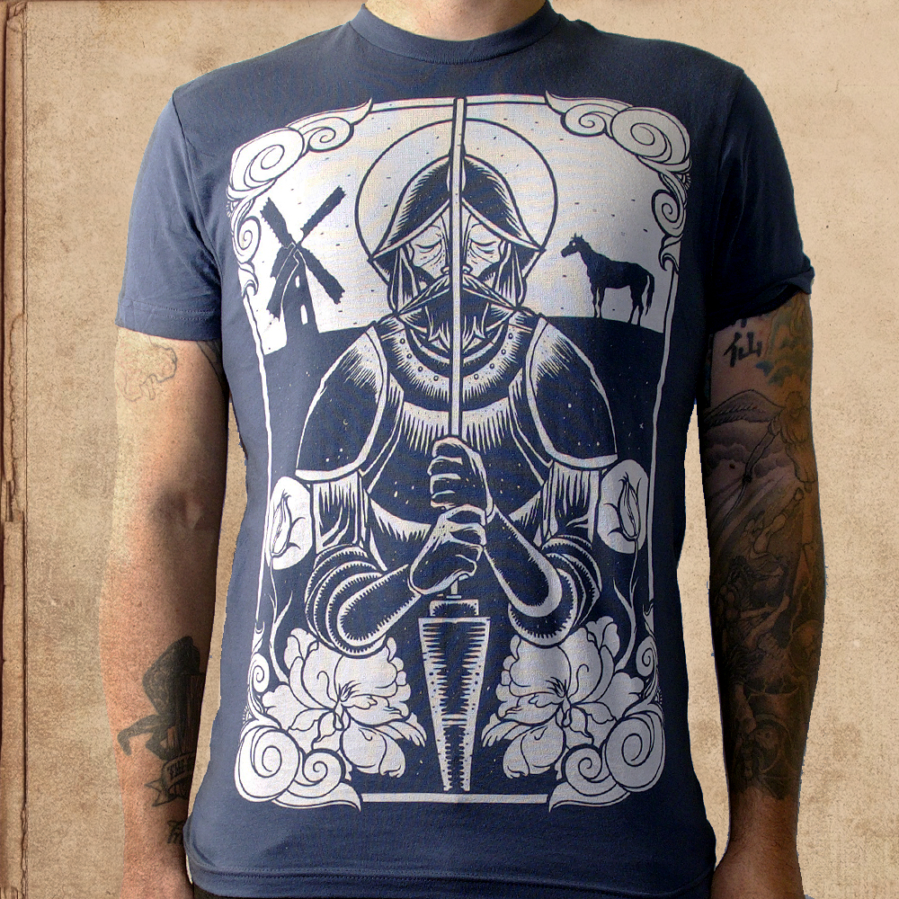
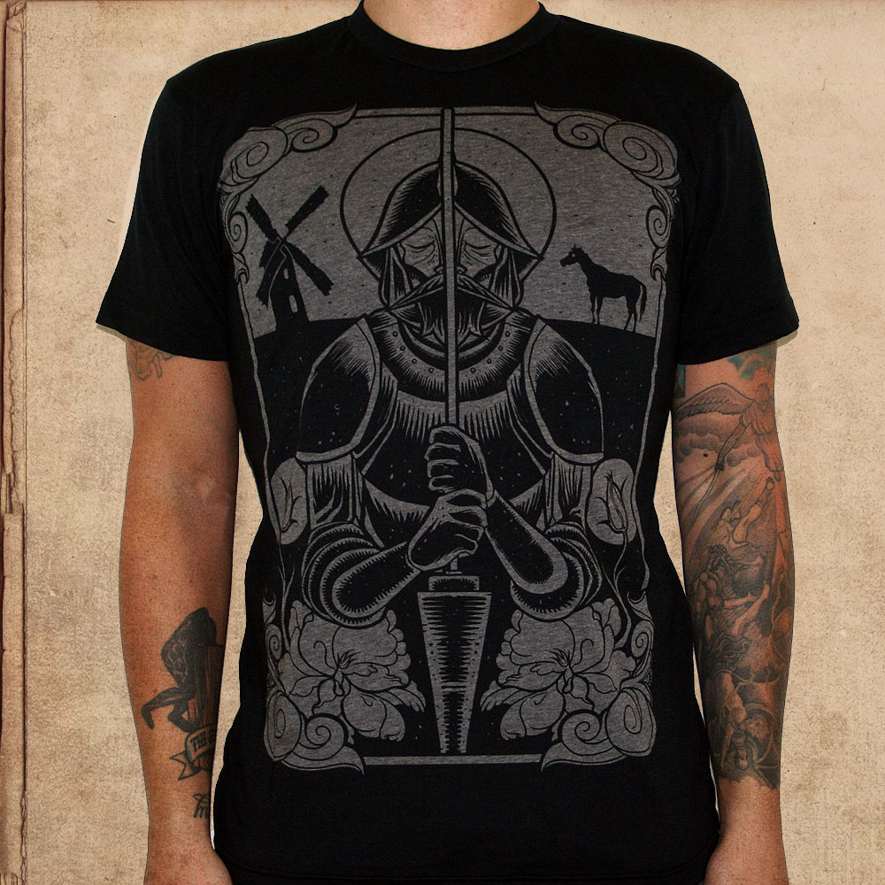
This Miles to go Don Quixote print is using straight plastic-charge with no added pigment, but 6% ZSF powder and printed onto a black poly cotton tee. Notice the image left behind is a heather grey. If this were done on a 100% cotton tee, the image would look more like the second Indigo version below. Both prints were done with the exact same ink. Next level tends to have a bone-white/light natural tone on the indigo blue.A black 100% cotton tee goes to a natural cotton tone.
I use poly/cotton blends often with miles to go in order to obtain specific looks which help distinguish the vibe of my brand and tend to be subdued color palettes and de-saturated tones. With discharge printing, you need to be flexible and I cannot stress that enough. There is a chemical process happening that’s results depend on the dye of the garment, the fabric construct, and every element of the tee. Below is a color chart from Gildan and it holds pretty true with similar colors on different brands. Royal blue for example will not work well for discharge. The grading scale is for how well it works, A being best and C meaning either don’t try it or cross your fingers and hope the end color is anything like you wanted. As you can see, royal blue is bad, but navy is good, etc.
Greg Ker has run Miles to Go since 2007.
Now has helps companies manufacture pins through pingamestrong.com
Need an E-Commerce Website?
 Shopify is perfect for beginners and experts. You don't need to have any technical or design experience to easily create a beautiful online store with your branding. Choose from tons of well designed e-commerce templates that look great on desktops, phones, and tablets. Easily customize, create pages, add products, and you're pretty much ready to accept payments. Plans come with a free no risk 30 day trial period.
Check out our in depth review of Shopify here and see why Shopify is our number 1 recommended shop for clothing companies.
Shopify is perfect for beginners and experts. You don't need to have any technical or design experience to easily create a beautiful online store with your branding. Choose from tons of well designed e-commerce templates that look great on desktops, phones, and tablets. Easily customize, create pages, add products, and you're pretty much ready to accept payments. Plans come with a free no risk 30 day trial period.
Check out our in depth review of Shopify here and see why Shopify is our number 1 recommended shop for clothing companies.