Written by: Sol Amstutz
Ah, coloring. It’s something every artist has loved since childhood, and some have grown to hate. Once again, like most things that are part of a greater whole, how you choose to color a piece can make or break it. Being color savvy is key, especially when working on things that are going to be screen printed.

Here we have some beautiful line work. Okay, neat. You could just stop there and print a cheap, one color design. But what if a client wants some color added in there?

Okay, you’ve got some colors going on now. However, can you really call this a finished piece? Some would, but there are some simple things you can do to give it that extra oomf. For example, the face is pretty blank and uninteresting, and the colors seem pretty basic.

So here I went in and added another (notice how its darker) color on on the face to give it some depth. This is where lighting comes in. Since I wanted to create the illusion of depth on the face, I added a color that is a shade of the color beneath it. If you want to save a color with this, you could make it a halftone of an existing color to achieve the same effect. There still seems to be something lacking here though…

Whoa! You can use the tee color as a color in the design to save on printing?! Yes, yes you can, and you often should as much as possible. The other thing you will notice is that I made the lines a shade of the hair color. What? Line work that isn’t black? Yes, you can do that too. This is more prominent if you’re working with a lighter tee, obviously.

Very often, clients like to see a few different color variations. When you’re doing these, keep the same principals in mind. Using shades of the same color gives it more depth and keeps in cohesive at the same time. Yeah, sometimes people want off the wall crazy colors that don’t match, which is fine if you can pull it off gracefully. You’ll also notice that I added a few little background elements just to fill up some space and make it look pretty (oohhh).
*Spoiler* Try using the hue/saturation slider in Photoshop to get a feel for what color combos work or don’t work.

I’ll leave you with a color combo that I would kinda barf at if I saw it on a tee. As I said, some might be into a more wacky color palette, but these colors just clash. The facial shading is too bright to be on top of that color, and overall they these colors are pretty vomit inducing together.
So as always, keep in mind how you can go the extra little bit to take your design to the next level. Cheers!
Need an E-Commerce Website?
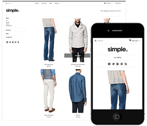 Shopify is perfect for beginners and experts. You don't need to have any technical or design experience to easily create a beautiful online store with your branding. Choose from tons of well designed e-commerce templates that look great on desktops, phones, and tablets. Easily customize, create pages, add products, and you're pretty much ready to accept payments. Plans come with a free no risk 30 day trial period.
Check out our in depth review of Shopify here and see why Shopify is our number 1 recommended shop for clothing companies.
Shopify is perfect for beginners and experts. You don't need to have any technical or design experience to easily create a beautiful online store with your branding. Choose from tons of well designed e-commerce templates that look great on desktops, phones, and tablets. Easily customize, create pages, add products, and you're pretty much ready to accept payments. Plans come with a free no risk 30 day trial period.
Check out our in depth review of Shopify here and see why Shopify is our number 1 recommended shop for clothing companies.