Article by: Austin Martin
I could go for days about typography. Typefaces, kerning, leading, tracking, etc., etc.
I thought, “Hey! I’m sure most people don’t really know the basic fundamentals of typography!”. This is not an insult to anyone’s knowledge. Many people on here haven’t gone to school for design or haven’t really done much reading on typography (which I suggest you get on!). I’m a huge lover of typography and love nothing more than a well treated type based design.
The largest typographic cardinal sin I see is poor kerning. I have mentioned this on many designs, but until today did I realize that most people probably don’t have the slightest clue what the word means. Now I will give you some dumbed down definitions of important words in the typographic universe.
*I’m going to use the term “grayness” a lot. This refers to the visual density of the type.
TRACKING
Tracking refers to the space between three or more letters (ie. a word, sentence, paragraph, etc).
![]()
Before you start kerning, track out your type until the general desired grayness is achieved. This will make the kerning process a little easier.
KERNING:
The word kerning refers to the space between individual letters. The adjustment you make to this space is also referred to as kerning.
http://www.papress.com/thinkingwithtype/text/kerning.htm
Kerning is tedious, but critical. It can make or break a design. The goal of kerning is to make the space between all the letters of a work to be visually equal. I say visually because in terms of measurement, most of the spaces will not be equal. This is due to the fact that each letter pair will have a different visual relationship. V and A are basically spooning. That rules, but it sucks when you have a couple like L and A in the same word. VALHALLA rules, but from a typographic stand point, it fucking sucks. There are a lot of pairs that just fucking suck and those are the ones that need special attention. The more you pay attention to type, the more you’ll notice these problem pairs.
Kerning will also vary between typefaces. The same word in a specific face will be kern totally different in another because of type anatomy.
One general kerning rule is the larger your type, the tighter your kerning can be. The smaller your type, the more space it needs.
One of the easiest ways to check your kerning is to look at your type as if it was just a bunch of nonsense shapes that interact with each other. What’s affecting your type is the negative space, not so much the letters themselves. My favorite way of doing this is printing out the sentence/headline I’m having difficulty kerning and I’ll tape it to a window, backwards. This forces you to ignore the standard way of looking at your words. Yes, many of us are talented at reading reverse, but doing this allows you to really see the letterforms for what they really are; shapes. What I’ll do then is go in with a highlighter and mark the trouble areas, go back to the computer, fix them, then print it out again. I’ll usually leave it and come back to it later. Maybe even a couple days later. This lets you get rid of all your bias and come back fresh. Doing this will greatly improve you sense of kerning and give you a new perspective on type. I promise.
LEADING
Leading is the amount of space between two or more sentences/lines of type.

Improper leading can result in a design that is either unreadable or un-united. To maintain unity in your design you need to make sure that space between lines is aesthetically pleasing. Make sure it’s not so tight that it becomes unreadable, though.
Once again, this varies between typefaces. Certain typefaces have very short ascenders and descenders and can have less leading. Others, like Bodoni, have very tall ascenders and need generous leading between lines.
*Leading is called so because typographers actually put blocks of lead between lines of type.
Being able to apply these three major rules is key to a properly executed type tee design.
It is also very important to use the appropriate typeface in every given scenario. This mostly comes from doing your research (an innate capacity for typographic aesthetics doesn’t hurt). I’m sure a lot of designers on here have no desire to know the history behind Helvetica or Rockwell or American Typewriter or News Gothic, but I personally don’t like to use a typeface until I’ve read up on it. Sometimes it’s nice to have ulterior motives for using a given typeface in a design. It’s all about intelligent design (not in the religious sense).
One more thing:
It is NEVER ok to stretch or squeeze type for ANY reason, EVER.
Oh and…

Here’s some book suggestions for you typophiles/aspiring typophiles:
Thinking With Type by Ellen Lupton

The Complete Typographer by Will Hill

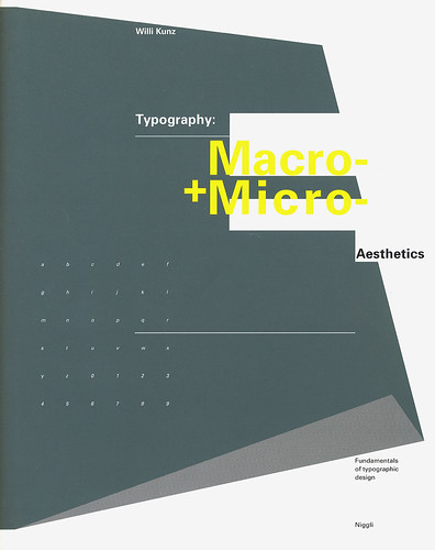
Typography: Macro+Micro Aesthetics by Willi Kunz
Need an E-Commerce Website?
 Shopify is perfect for beginners and experts. You don't need to have any technical or design experience to easily create a beautiful online store with your branding. Choose from tons of well designed e-commerce templates that look great on desktops, phones, and tablets. Easily customize, create pages, add products, and you're pretty much ready to accept payments. Plans come with a free no risk 30 day trial period.
Check out our in depth review of Shopify here and see why Shopify is our number 1 recommended shop for clothing companies.
Shopify is perfect for beginners and experts. You don't need to have any technical or design experience to easily create a beautiful online store with your branding. Choose from tons of well designed e-commerce templates that look great on desktops, phones, and tablets. Easily customize, create pages, add products, and you're pretty much ready to accept payments. Plans come with a free no risk 30 day trial period.
Check out our in depth review of Shopify here and see why Shopify is our number 1 recommended shop for clothing companies.

